A Simple Bar Chart:
-
Bar charts are visualizations that represent categories where the height of the bar represents the magnitude or quantity within a certain category.
-
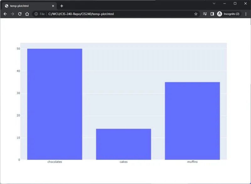
Ex: Let’s imagine we wanted to chart the inventory levels of desserts at a bakery sale.
- The Bar class in the graph objects model is what we’ll use to construct a bar chart.
- We can pass data into the go.Bar() class.
- The variable x represents the desserts and y represents the quantities available.
python
1import plotly.graph_objs as go
2import plotly.offline as offline
3
4trace0 = go.Bar(x = ['chocolates', 'cakes', 'muffins'],
5                y = [50, 14, 35])
6
7data = [trace0]
8offline.plot(data)
Output:
A Bar Chart With Multiple Traces:
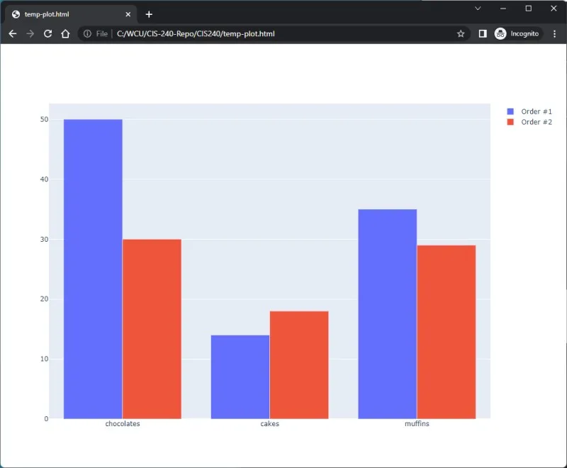
- Next, let’s assume that this bar chart represents not inventory at the bakery, but instead, orders (Order #1 and Order #2) placed with a certain bakery. Therefore, we’ll have multiple traces.
- The data for our plot contains the two traces represented in a list format on line 11.
- Note we want the resulting visualization to represent both of these bars next to each other, therefore we can use keyword argument barmode is equal to group on line 12.
python
1import plotly.graph_objs as go
2import plotly.offline as offline
3
4trace1 = go.Bar(x = ['chocolates', 'cakes', 'muffins'],
5               y = [50, 14, 35],
6               name = "Order #1")
7trace2 = go.Bar(x = ['chocolates', 'cakes', 'muffins'],
8               y = [30, 18, 29],
9               name = "Order #2")
10
11data = [trace1, trace2]
12layout = dict(barmode = 'group')
13fig = dict(data = data, layout=layout)
14offline.plot(fig)
Output: